All posts filed under “Apple

Care

Last night someone I don’t know got in touch with me, politely and humbly to ask for some advice on a professional matter. This is not uncommon, and I always make time to offer what help I can; I can’t promise I’ll actually ever help, but what I’ve got is yours as much as it’s mine.

Most every time I do this I think of Susan Kare, the quite literally iconic designer best-known for creating the icons and visual feel of the original Macintosh. When I was writing my dissertation at university, on the influence of UI design on the creative process, I emailed her to ask a couple of questions. I don’t know where she was working at the time, but she would have been busy and important, and yet, magically, she replied. Two important things for me flowed from that email. The first was small and specific, but fascinating: Kare said that when designing icons, it was less important that what they represented was immediately, intuitively obvious, and more important that, once you’d learned what that icon represented – what the link is between that little grid of pixels and the action that will result when you click it – it is a strong, unbreakable semantic association.

The second was something that has only grown in the 20-some years since I dialled up the internet and polled my POP3 server to receive that email. As I have myself got busier, and more senior, and with more calls on my attention, I more appreciate the time Kare took to reply. If ever I feel like I can’t be arsed, if ever the person getting in touch is presumptuous or even rude, if ever I feel like I should be getting paid for what is in effect some free consultancy that seems to devalue the experience and knowledge I’ve built up in my career, well, then I check myself. Dear god, if Susan Freaking Kare can take 20 minutes to read and reply to an email from a green undergrad, I can carve out some time to offer the best I can to someone who asks about what mic to buy, how to get into journalism, or wants me to sense-check their CV.

I’m still besieged by impostor syndrome, and I worry I give bad advice, but so long as I caveat what I say, then surely far better that I make time to try to help, and give someone the basic courtesy of one’s attention, rather than, embarrassed, denying folks whatever I know out of my own neurosis.

I don’t, I hope, solely do this because I want folks to think of me kindly for as long or as often as Kare’s kind act has made me think of her, though I’m not a good and self-contained enough person that that doesn’t play a part in it. But rather, I remember how shocked, delighted and excited it felt that some far-off, remote figure I contacted read and replied to my message, and I want to always honour that feeling. Absolutely fuck anyone who pulls the ladder up behind them. And thanks again, Susan.

Flocking icons

When I was a kid, and because I was that sort of kid, I remember watching an Open University programme that explained emergent behaviour: that huge whirling flocks of birds and impossibly dazzling, twisting shoals of fish might seem complex, but each individual was following a couple of deeply simple rules about movement and maintaining a particular distance from others. I was particularly struck when some crude computer graphics demonstrated this; the simple points following these rules and moving through a 3D volume, big white pixels on a bulging CRT, did indeed look exactly like flocking animals as they wheeled and bunched and flowed round obstacles. The idea of emergence is one that I kept thinking about in the decades since, that from very simple rules awesome and seemingly unknowable complexity can arise.

Anyway; I was thinking about it again yesterday as I was using the iPhone’s turn-by-turn directions when driving; it’s not an example of emergence as such, but it suddenly occurred to me that the algorithm by which Maps decides when to hide and show labels and details – which are constantly shifting and changing as you move – probably has at its heart a flocking behaviour that governs optimal information density and stops labels crashing into each other.

Yo’ Watch’s so slow it thinks it’s last Thursday

Using apps on the Apple Watch, even with native watchOS 2 apps, is so slow that I have time to launch an app on the Watch, grow bored waiting for it to show the information I want, pull my iPhone out of my pocket, launch the same app, get the info, tap around a bit for more info, get distracted by the telly, put phone down, glance at Watch to see the time, and have to quit out of the still mutely spinning app I launched in the first place.

And yet I still love it – because for me at least it’s not about ‘launching apps and doing things with them’ like on the iPhone, but about glancing at the time and other useful snippets of information, rich and timely notifications, and short, Siri-issued commands. Sure, I’d like it to be faster for apps, but the fact that it’s not doesn’t make it a bad product – for me.

How and why I use the text expander system built into iOS and OS X

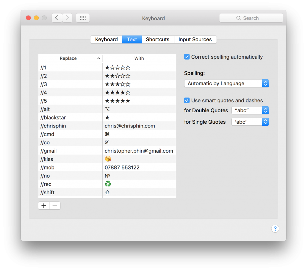
Built into OS X and iOS for a while now has been the ability to define text expander shortcuts, so that if you type ‘omw’, for example, the system will replace it with ‘On my way’. It’s handy, and what’s more so long as you’re signed in with iCloud, all the shortcuts you define will be available on all your Mac and iOS devices. I use it a lot, often as a way of easily typing emoji and Unicode; yes, you can use the character palette in OS X and the emoji keyboard in iOS for this, but they are slow compared to just bashing in a short string of characters, and with the latter you don’t get access to Unicode characters at all. Here are some of the shortcuts I have set up:

Text expander shortcuts

One thing you’ll notice is that all the ones on this screen start with two slashes. That’s to make the string unique to this task, so that if I just type ‘no’ for example, I won’t find it’s been autocorrected to №. Of course, I could instead have chosen a different string to trigger the replacement, one which I wouldn’t ordinarily type such as ‘nosymbol’, say, but I want always to keep the trigger string short and easy to remember, otherwise what’s the point?

The choice of a double slash is deliberate. I got the idea originally from Craig Grannell, but if I remember correctly he leads with ‘[[’, and while that’s fine, the bracket symbol is two levels down in the iOS keyboard, and since I want to use these shortcuts everywhere – and since this is all about saving time – I’ve found this to be a more useful solution.

I don’t just use these shortcuts for typing symbols, though. As you can see, I use them as a quick way of typing out my email address or phone number – useful in forms if AutoFill is playing up – and there are some phrases I use often which have shortcuts that are hidden off the bottom of the list; because for these I can easily use trigger strings that aren’t real words, they don’t have to have the leading double slash.

You could go even further. If, for example, you do a tech support job, rather than typing hurried and terse emails to users, then, because of course we all know that most problems are solved with a handful of solutions, you could set up ‘tioaoa’ to expand to “In many cases, problems like this can be solved simply by restarting the computer; try choosing Restart from the Apple menu at the top left and see if that fixes it. Of course, if it doesn’t, please do let me know”. You could construct complete template emails or Slack messages this way, or just create a few jigsaw piece-like phrases that you can stitch together to save yourself tens of thousands of keystrokes.

So that these phrases do autocomplete in OS X, make sure in Edit ▸ Substitutions ▸ Text Replacement is checked in whatever app you’re using to enter text. Oh, and I’ve just added ‘//submenu’ to my list so that I can easily type ‘▸’; this is an always-evolving process!

Comparing the iPhone 6 and 6s as cameras

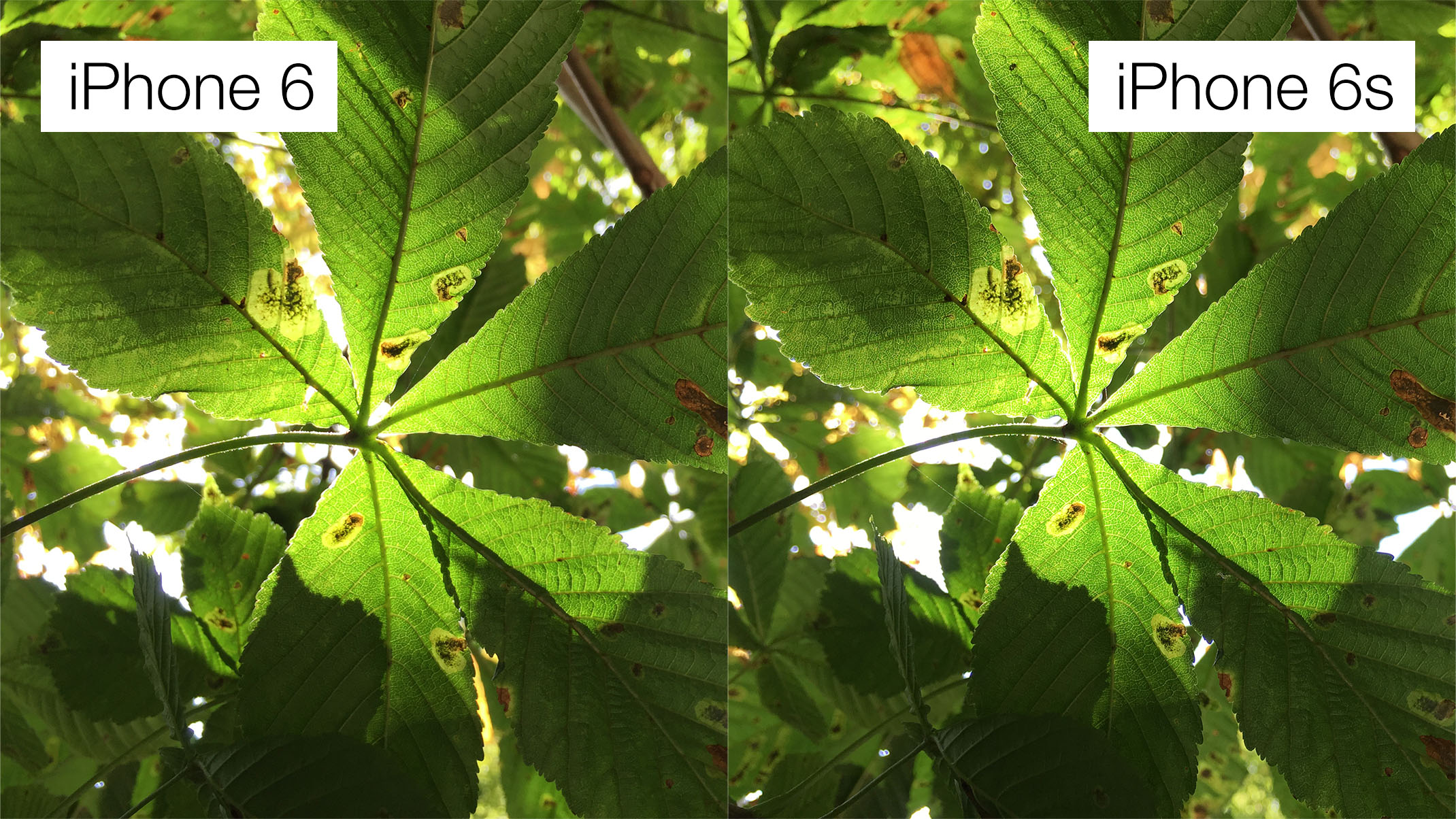
Macworld asked me to write about how the iPhone 6s compares to the iPhone 6 considered solely as cameras. In other words, how much better is the 6s’s camera than the 6’s?

It was a hugely fun thing to write. Well, it was logistically a complete pain in the arse as it had to be turned around quickly, and on a weekend when I thought I’d be able to give my wife a break from wrangling our sometimes fractious baby daughter I was instead haring all over town taking photos then locking myself away for snatches of time in my office to try to analyse the shots and marshal my thoughts into a coherent narrative.

But when I eventually turned in at 2am early on Sunday morning, having completed a first draft, I was buzzing. It’s a really simple thing, but it was so lovely to have the opportunity – thanks, Susie! – to set out with an open mind, take a bunch of carefully-planned sample shots and footage, and then sit down, sort through it all dispassionately, and have the rewarding experience of seeing original conclusions and judgements emerge which I’m confident in and which I think are genuinely useful.

It’s quite long – and boy, do I fret about writing flabby prose; I hope my editor friends won’t be secretly thinking I could easily have cut it in half – but there’s a tl;dr version at the end if you want to skip straight to that. Set aside 10–20 minutes and have a read; I’m proud of this one.

Another reason to buy Apple’s ‘s’-generation iPhones

I am sometimes quite dim, and so it took me a while to realise that Apple’s focus on the strength of the “7000 Series aluminium” used in the iPhone 6s was probably tacitly – not explicitly; never explicitly – addressing ‘bendgate’. This, the discovery shortly after launch that the iPhone 6 could deform with enough pressure applied along its length, was mostly a PR problem for Apple rather than an actual problem for its customers, but that’s why using PR to counter it this time round makes sense.

This, though, prompted another thought, building on what John Gruber recently wrote about how the every-two-years ‘s’-generation iPhones are the ones to buy, and it’s this: s-gen buyers effectively have had their phone’s design beta tested by millions of users, over trillions of hours of use, generating tens of thousands of data points in Apple’s support infrastructure, and this means that Apple has the opportunity to correct flaws in the original, non-s variant of that design.

You could argue that there shouldn’t be flaws in the first place, and you can be damned sure Apple tests thoroughly, exhaustively, both in the real world and with mechanisms designed to mimic extended periods of use, but I suspect there’s just no substitute for millions of users actually, really, properly using a product when it comes to revealing areas of weakness.

Here’s another example: some iPhone 6 users have been affected by the front-facing camera gradually moving – or presumably more accurately, being knocked and nudged – off centre, revealing a (harmless) crescent moon shape off to the side. That’s exactly the sort of thing that I can imagine easily fails to surface during internal, prerelease testing, but now Apple has enough reports of it, it can in theory use that information to correct it with the iPhone 6s.

This whole theory is bunk, mind you, if the lead times for design and manufacture are so short as to make it impossible to incorporate changes within the annual cycle Apple releases phones on. I just don’t know; it seems really short to me, but, from a position of ignorance, it strikes me as not out of the question, if a revealed flaw is sufficiently severe.

Hyper-personal watchOS 2 apps

Imagine you were immensely rich, and you lived a hundred years ago. Imagine you wanted to be able to know, at a glance, at any time, how immensely rich you were – your net worth. I could be wrong, but I think it probably couldn’t be done; merely gathering never mind collating the data would take, what, hours? Days? Imagine you wanted to have that data available on your wristwatch. Imagine the infrastructure that would have to be developed, never mind the mechanical machinations involved in displaying it. Your immense wealth literally – probably – couldn’t buy you what you wanted.

If today you are immensely rich and want to know, at a glance, at any time, how immensely rich you are, you could have a developer create a bespoke Apple Watch app just for you that gathers information in real time, collates it, and presents it as a complication.

And the thing is that you don’t even have to be immensely rich. If you have a strong and unique enough need for a small snippet of information to be always updated and always available, it’s not ridiculous to commission a dev to create a Watch app for you that does so. What a hundred years ago no amount of money could buy, today a small amount of money can easily buy.

A Watch is a less weird thing to strap to your body than a watch

Watching – lol – a TV programme last night, I clocked – lol – that the presenter was wearing a regular watch. And in the way of things, like when you say a word over and over and it starts to sound utterly alien, my mind started thinking how odd it was that we spent hundreds of years with the time – and only the time – strapped to our bodies. Yes, it was and is useful, and I know the story of train travel forcing standardisation of time and so on, but it’s one of those ‘if an alien came to Earth’ things; why is knowing the exact time – for a given value of ‘exact’ – so important to you Earthlings that you strap it to your body so it’s with you at all, as it were, times?

Contrast this with the Apple Watch, which, yes, tells you the time. But also tells you if it’s going to rain, when to take your pizza out of the oven, what your friend thinks of your new haircut, where your nearest hairdresser is, when your next haircut is, and so on. It’s so much less weird of a thing to have strapped to your body, so much less weird of a thing to glance at, simply because it’s so much more capable and flexible.

(Now the phrase ‘strapped to your body’ is now starting to sound weird.)

How to set the size of Finder windows, and other tips

John Gruber draws my attention to a post on Macworld by the redoubtable Glenn Fleishman wherein he tries to solve a reader’s problem about getting Finder windows to open at a consistent size and location.

I read the trick for doing this many years ago (though where I can’t remember), and it’s always worked; it’s a little simpler than the suggestion Glenn follows. (And yes, you could argue as Gruber does that the fact that no less a man than Glenn doesn’t know this suggests it’s far too hidden and therefore broken a behaviour, but I’m here to solve this problem for you rather than bellyache.)

To have Finder windows in OS X open at a consistent size and location, open a new Finder window, resize it to how you want, then, and this is the important bit, close it again before you do anything else. Just open the window, resize and reposition it, then close it. Don’t click icons inside it. Now, subsequent new windows will be at the same size and position.

Here are a couple of bonus tips I always use. The first is that as well as resizing and repositioning the Finder window itself, you can also change the width of the Sidebar and the columns in column view – I always default to column view – and these will be remembered too. The Sidebar will actually snap to width of the widest thing listed, which can be handy. To adjust the column size, hover over one of the vertical dividers and drag; so far, so obvious. The extra little tip is that if you hold ⌥ then all columns resize at once. You can do both these adjustments on the new window you open above to set the default size and position.

Second, because I am the way I am, I like my windows to be neat and central. You can do this by, when you open your new Finder window to set the position, first dragging it up to the top left corner of the screen, allowing it to be as high up as possible and actually overlapping the left edge of the screen a little. Now click the green button at the top left of the window while holding ⌥ so that the window snaps to the top left of the screen, drag the bottom right corner right down to the bottom right of the screen, then grab one edge of the window while holding ⌥ and ⇧ to resize it down proportionally; you might need to release ⇧ at some point to get a nicely balanced window, but the joy is that it will now be right in the middle of the screen, every time.

Finally, remember that you can set which folder a new Finder window opens with in the General tab of Finder’s Preferences. I have this currently set to my main work folder, containing sub-folders for all my clients, but when I worked on a magazine I had it set to a particular folder into which I’d drag aliases for all the current stuff I was working with. Some aliases – to folders on the server, say – never changed, but some were replaced every month as I’d turn my focus to a new issue. This approach meant – and means – that whenever I hit ⌘N in Finder, I get immediately shown the most relevant current stuff, and because I’d have followed the earlier advice above, the window is in the right position, is the right size, and is perfectly centred.

Personality and playfulness in tech

A few days ago, I spoke at the terrific Lightning Talks night at SWmobile, and my pitch in my 10-minute talk was to make today’s devs think about rediscovering the joy and delight that comes from personality and playfulness in software and hardware. I’ve recreated the talk above, and I’d also encourage you (especially if you’re a dev, and doubly especially if you make iOS apps) to watch the talk from my friend Paul Hudson, from the same night, on UIStackView and why it makes iPad multitasking much easier. I adore Paul’s presentations, and I think you’ll see why when you watch it.

A postcript: I’d like to explain the technical gremlins that prevented me from using the audio I recorded on the night in the above video, which was my original intention. I was using the Sennheiser ClipMic digital, and the app it plugs into uses a clever but flawed demo model. It’s free, and by default it’s limited to 60 seconds’ recording, which you can unlock with an IAP. Plugging in the mic also unlocks the full app, but as I discovered, you do have to plug in the mic to unlock it; you can’t just have it already plugged in then launch the app, as then the restriction-lifting unlocking isn’t triggered. I didn’t realise till after, having tested it sitting in the audience, gotten my gain right, and confidently walked up to the front, that I had merely recorded 60 seconds of shuffling and throat-clearing.