All posts filed under “Technology

How to set the size of Finder windows, and other tips

John Gruber draws my attention to a post on Macworld by the redoubtable Glenn Fleishman wherein he tries to solve a reader’s problem about getting Finder windows to open at a consistent size and location.

I read the trick for doing this many years ago (though where I can’t remember), and it’s always worked; it’s a little simpler than the suggestion Glenn follows. (And yes, you could argue as Gruber does that the fact that no less a man than Glenn doesn’t know this suggests it’s far too hidden and therefore broken a behaviour, but I’m here to solve this problem for you rather than bellyache.)

To have Finder windows in OS X open at a consistent size and location, open a new Finder window, resize it to how you want, then, and this is the important bit, close it again before you do anything else. Just open the window, resize and reposition it, then close it. Don’t click icons inside it. Now, subsequent new windows will be at the same size and position.

Here are a couple of bonus tips I always use. The first is that as well as resizing and repositioning the Finder window itself, you can also change the width of the Sidebar and the columns in column view – I always default to column view – and these will be remembered too. The Sidebar will actually snap to width of the widest thing listed, which can be handy. To adjust the column size, hover over one of the vertical dividers and drag; so far, so obvious. The extra little tip is that if you hold ⌥ then all columns resize at once. You can do both these adjustments on the new window you open above to set the default size and position.

Second, because I am the way I am, I like my windows to be neat and central. You can do this by, when you open your new Finder window to set the position, first dragging it up to the top left corner of the screen, allowing it to be as high up as possible and actually overlapping the left edge of the screen a little. Now click the green button at the top left of the window while holding ⌥ so that the window snaps to the top left of the screen, drag the bottom right corner right down to the bottom right of the screen, then grab one edge of the window while holding ⌥ and ⇧ to resize it down proportionally; you might need to release ⇧ at some point to get a nicely balanced window, but the joy is that it will now be right in the middle of the screen, every time.

Finally, remember that you can set which folder a new Finder window opens with in the General tab of Finder’s Preferences. I have this currently set to my main work folder, containing sub-folders for all my clients, but when I worked on a magazine I had it set to a particular folder into which I’d drag aliases for all the current stuff I was working with. Some aliases – to folders on the server, say – never changed, but some were replaced every month as I’d turn my focus to a new issue. This approach meant – and means – that whenever I hit ⌘N in Finder, I get immediately shown the most relevant current stuff, and because I’d have followed the earlier advice above, the window is in the right position, is the right size, and is perfectly centred.

Affinity affinity, or, why I’m a Serif fanboy

Affinity Photo screenshot

This morning I tweeted to congratulate Serif on the release of Affinity Photo, its new image-editing app which joins the vector app Affinity Designer (already out) and DTP app Affinity Publisher (out later this year). I said, within the 140 character constraint, that the apps in the Affinity suite are genuine challengers to Adobe’s market-dominating apps, and I worried for the rest of the morning about how that comment was interpreted. Hence this post which, uh, expands on the point.

There are two things to consider here. First, are the apps actually good enough for people to consider them instead of Photoshop, Illustrator and InDesign, and second, what is the nature of the ‘challenge’?

To the first: yes, with familiar caveats. Affinity Designer, the only one I’ve used, is not merely as powerful and flexible as Adobe Illustrator is but in many ways it’s more so. Yes, there are likely edge cases where certain Illustrator features and workflows won’t be available or will be clunky in comparison, but it’s even more likely that Designer’s advantages – fast, consistent, modern and easier (for me at least) to use – will offset these for many, many people. In any case, Serif is iterating hard. If you’re familiar with Illustrator, there will be a slight learning curve in switching to Designer, but the app is generally so much of a delight to use that not only will you grasp it quickly but you’ll also wonder why Adobe didn’t do things like that years ago. Serif is fortunate that they put themselves in a position to start with a completely blank slate in creating this fully integrated suite, instead of, as with Adobe, having to deal with millions of lines of legacy code which, crucially, often originated in different companies and had to be made to feel and behave like a suite – and the effect is wonderful.

The other caveat is one we know well from the Office story; in commercial workflows, consistency of tools and file formats for interchange are important, and you might suggest that while one-man-band illustrators or small studios could make the switch easily, it’s much harder for full-scale agencies and publishers. And this is likely true, but for far fewer cases than you might expect, in part because the native formats for the Affinity suite are widely compatible, but also because Serif knows this is a problem and puts a lot of stock in robust import and export of even the Adobe formats such as .psd and .ai. Still, while I haven’t done enough in-anger work to know empirically, I wouldn’t be surprised to learn that busy, fecund companies ran into a few small but important glitches in fitting into the Adobe-dominated industry workflows if they switched to Affinity.

(Of course, plenty will start with Serif’s apps rather than switching from Adobe’s, and there’s a fair bit of friction involved in getting people convinced they should even entertain switching if they’re comfortable in Creative Cloud.)

My second point, though – what do I mean by saying Serif challenges Adobe? – is the one that worried me more.

I’m always sceptical when someone claims an app can challenge an incumbent. It’s hard to do, in part because of the reasons above, and also because usually there’s a good reason the incumbent is the incumbent. It takes a lot of hard work, fresh ideas and money, and a long time, to challenge one. Usually the new app just isn’t very good, whatever the PR exec tells you.

The Affinity apps actually are very good, and they definitely can challenge Adobe’s. Be careful how you define ‘challenge’, though. I don’t think it’s likely we’ll see Serif any time soon doing to Adobe what InDesign did to QuarkXPress; the current Adobe apps aren’t as stagnant as XPress was then, and nor is Adobe as arrogant as Quark at the time. That’s not what I mean. You don’t have to vanquish a competitor to be a success; this isn’t a zero-sum game.

Affinity Designer, though, absolutely and completely is a viable, pro-level alternative to Adobe Illustrator. It’s not a ‘have-made-an-app-that-can-draw-vector-shapes-and-lines-so-ship-it!’ effort from a lone developer. It’s not a weird open source excretion, powerful but ugly and opaque. It sprang fully-formed, mature, polished and easy to use, into existence. Indeed, it’s not just an alternative to Illustrator, I find it faster, easier and more pleasant to use than Illustrator. I expect the same is true of Photo and will be true of Publisher.

The first time I met with Serif to talk Affinity Designer before its launch, I confess my sceptic-o-meter was registering high. This was an old company I associated, fairly or not, with cheap PC software found in those big bins of £5 CD-ROMs in Tesco or given away on magazine coverdiscs. But I sat in the meeting room and went from scepticism to surprise to interest to amazement to excitement. I came out a convert and walked round the office telling people how awesome Designer was.

The app itself, though, was just part of it. I’ve met plenty of software bosses, and have come to expect either greasy, unpleasantly macho douchebags who might as well be selling fish fingers for all they apparently care about the product rather than the company, or technical neophytes who you suspect can’t even use the software never mind answer any vaguely technical question about it. Neither was true of Serif’s managing director, Ashley Hewson. He was clearly wildly proud of and excited by what they were doing, and could talk both knowledgeably about the products, and with frankness about strategic plans and business.

Serif also earned Brownie points with me for bringing along lead developer (technically, Head of SerifLabs) Tony Brightman, a man whose passion and pride shone like a beacon, and who with a little coaxing would go into delighted detail about why this works like that and why it’s important that this does that.

The vibe I get off the folks I talk to there isn’t the shellac of professional, because-I’m-being-paid-to excitement; it’s the real deal. They’re making all sorts of decisions – cheap but sustainable pricing, no subscriptions, commitment to upgrades, no bolt-on cloud service because we’ve all got Dropbox, right? – that serve the customer first, and they seem so very happy to be doing so.

I can root for Serif and I can root for Adobe. Inertia and familiarity, having been using Photoshop since I got 3.0 bundled with a SCSI scanner when I was a teenager, will keep me using Photoshop for a long time, and it’s important I note that it is still the pre-eminent image manipulation tool for good reason.

It’s rare that I can be so completely positive about a company and its products, but I am here. I encourage you to check out Designer and now Photo – the latter of which, as I write, has introductory launch pricing of £30/$40/€40, 20% off – and challenge you not to be as excited as I am about these products and the company that makes them.

They’re doing things right. They’re bona fide. They deserve every success; whatever the company’s ambition in the industry, I hope the market will reward such customer-centricity, quality and heart.

Personality and playfulness in tech

A few days ago, I spoke at the terrific Lightning Talks night at SWmobile, and my pitch in my 10-minute talk was to make today’s devs think about rediscovering the joy and delight that comes from personality and playfulness in software and hardware. I’ve recreated the talk above, and I’d also encourage you (especially if you’re a dev, and doubly especially if you make iOS apps) to watch the talk from my friend Paul Hudson, from the same night, on UIStackView and why it makes iPad multitasking much easier. I adore Paul’s presentations, and I think you’ll see why when you watch it.

A postcript: I’d like to explain the technical gremlins that prevented me from using the audio I recorded on the night in the above video, which was my original intention. I was using the Sennheiser ClipMic digital, and the app it plugs into uses a clever but flawed demo model. It’s free, and by default it’s limited to 60 seconds’ recording, which you can unlock with an IAP. Plugging in the mic also unlocks the full app, but as I discovered, you do have to plug in the mic to unlock it; you can’t just have it already plugged in then launch the app, as then the restriction-lifting unlocking isn’t triggered. I didn’t realise till after, having tested it sitting in the audience, gotten my gain right, and confidently walked up to the front, that I had merely recorded 60 seconds of shuffling and throat-clearing.

Alphr

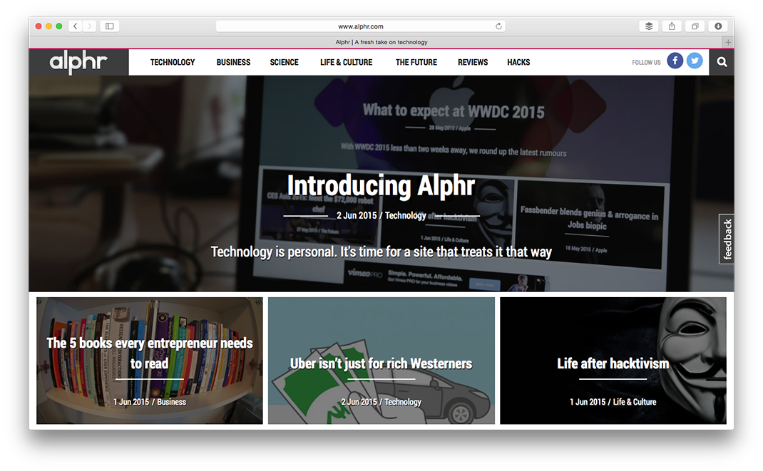
I’m hugely proud to have contributed a few pieces – with more coming – to Alphr, the new website from Dennis Publishing. I’m proud because I think it’s a smart, initially counter-intuitive idea – producing what is essentially a business tech site with a consumer tech ethos, having recognised that UK IT decision-making is done by everyone, not a few thousand CTOs – and because it’s being made by some fantastic people at a company I have tremendous affection for.

When MacUser closed, I mourned the loss of an important magazine with a rich and pleasingly eccentric heritage, I worried for the people it gave employment to, but as well I was, selfishly, saddened that now finally able to write for it again, I never would. MacUser was my first job out of university, and although moving to London and learning to run my own life was challenging, and although I was a dick to many people, and although the job was demanding, and although I made countless mistakes, still, still I look back on those five years as some of the best in my life. The corporate culture at Future never sat especially comfortably with me, but the energy at Dennis truly was of the mildly anarchistic, Wild West kind that you would expect if you know to expect anything at all.

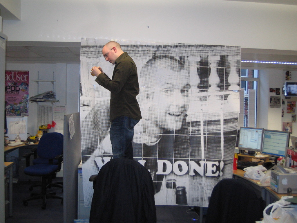
It’s always dangerously reductive to hold up one example as emblematic of something so complex as a company or its culture, but indulge me an anecdote. In the way of offices, somehow, saying “well done” to Dave Stevenson became a thing. One day, having discovered the Rasterbator, we – or possibly just I – decided to make a giant poster on this theme while Dave was in a meeting. We were part-way through taping the A4 sheets into rows and then the rows into the full poster, when our publisher, Ian Westwood, came out of his office and asked us what we were doing. We sheepishly confessed; he paused for a second then said, “Come on then! I’ll give you a hand so we can get it done before he gets out of his meeting.” We did.

Well done, Dave

Which brings us back round to Alphr, which is headed up editorially by the mensch who gave me my first job, Ian Betteridge, and the truly lovely and wicked sharp Tim Danton. I think that the same spirit I remember from my days at Dennis – the best bits of a startup mentality without all the bro shit, and an environment that encouraged experimentation, valued erudition, and above all just wanted to produce good stuff – suffuses the site. It feels fresh and vital and exciting, and it deserves every success.

Here are the first few pieces I’ve written for it that have gone live:

Everything is awesome and everyone should shut the fuck up. My original headline was slightly curtailed; probably something to do with making it fit, I imagine.

Confessions of a tech nerd: Why I buy obsolete computers. The existence of this piece will come as no surprise to anyone who reads my Think Retro column, but I’ve ever explicitly written there about why I buy vintage tech. Now I have, here.

Your laptop is an ergonomic disaster area: here’s how to fix it. We all love laptops but they don’t love us. You can, however, mitigate their ergonomic impact.

Don’t ask me what I use my Apple Watch for – you’ll only be disappointed

Predictably, understandably, laudably, the question I’m always asked about my Apple Watch is what I use it for. This presents a tricky social situation.

Some people might as well have asked “Pff! What do you use that overpriced twatbangle for, you gullible first-world bumboy?”

Some ask with doe-eyed, kawaii enthusiasm, wagging their tails like sparkly cartoon puppies, desperate to be told that I use it for EVERYTHING and that it’s AMAZING and that I LOVE IT AND I LOVE YOU AND WOULD YOU LIKE AN ICE CREAM‽ 🍦🌈😍

Some are genuinely curious. They’re open. Interested. Ripe.

My real answer will please none of them. The real answer is that there is no big, spectacular thing that I use my Watch for in the fortnight I’ve had it. All I can offer are personal anecdotes.

The thing that prompted this post happened when I was preparing dinner earlier tonight. I had put some rice on, and when it came to the boil, I turned the heat down to low then lifted my wrist and said “Hey, Siri; set a timer for 10 minutes.” That was it. I didn’t touch the Watch. I didn’t wait till Siri tapped me on the wrist to confirm she was listening. I actually didn’t even check she’d heard me till a few minutes later when I glanced at my wrist to see how long remained on the Complication on my watch face. (That surprised me.)

I don’t like the Apple Watch because it’s overtly impressive. Actually, it’s the opposite. It is – or perhaps more accurately, might just conceivably prove with hindsight to be – one of the first examples of technology whose job is to impress you by its very ignorability.

And nobody who asks me about it wants to hear that.

Visual directions on the Apple Watch

After communication, probably the thing I value my iPhone for the most is in helping me navigate – Maps, Citymapper, boarding passes, planning train journeys and so on. I love that I simply don’t have to stress about that stuff in the slightest any more. Moving some of that stuff onto the wrist makes a huge amount of sense, and it was going to be one of my key uses for an Apple Watch too.

Having watched the tour for Maps, though, I’m just a little disappointed. Functionally, completely fine, and the haptic feedback will doubtless work well. But I’m disappointed because the turn-by-turn directions are presented non-visually. It’s ‘in 30 yards, turn left onto Durham Road’ stuff. As I say: functional, will get you there, and is doubtless suited to how many people navigate.

My mind, though, is better-suited to visual cues. When I’m using a satnav in my car, I turn voice prompts off and I rarely read any road names; instead, I’m just glancing to see where the wiggly blue line of my route is leading and translating that into the landscape I see out the window. I’d far rather be able to glance at my wrist and see a visual confirmation of where I should be going, just like I do on my iPhone while driving, rather than having to think consciously about distances and hunt for sometimes missing or obscured street names around me.

It might be fixable; I can’t imagine that showing 2D visuals would use any more power than the current system, even if it’s decided that showing a live 3D representation is too much of a trade-off. I note too in that video that there are two paging dots at the bottom of the directions screen, so it’s possible that there’s a nice visual map on the other tab Apple just isn’t showing in the video.

And indeed it might be, as is so often the case, that Apple knows what I want better than I do myself, and that I’ll quickly and completely become comfortable without that visual crutch, happy to depend utterly on the haptic feedback. Only a few days left before we can find all this stuff out!

I’m excited about the Apple Watch – and that’s okay

As a technology journalist – or at least, a certain type of technology journalist – you subconsciously internalise a lesson: never be excited about anything. Because as soon as you are, people will rush to tell you two things: the first is that the thing you’re excited about is to a given extent stupid and pointless (and so by extension are you, both for being excited about it and just in general), and the second is that you are an unthinking shill for the company which makes it, hell-bent on brainwashing the public with your hagiographies – and so completely corrupt and untrustworthy.

I’ve gotten pretty good at dealing with (read: ignoring) both over the years, but I’m still not strong or arrogant enough for them not to bother me at some level.

However, I’m hugely excited about buying an Apple Watch, and anyone who would seek to make me feel small about that can fuck off. I am quite aware of the criticisms of smartwatches in general and the Apple Watch in particular, and I acknowledge at least the possibility that it will prove to be an expensive bauble, an ultimately doomed gewgaw, even though it seems unlikely.

But I’m excited to find out for myself. I’m a technology enthusiast – a discerning one, not a blind one, I think. I’m looking forward to finding out what the Watch does, how it changes me and those around me; having a front-row seat for the show sounds like fun.

On Friday, when I preorder my Apple Watch, I will be excited. I can understand why the public would find that an unseemly emotion in a journalist, but it doesn’t have to come at the expense of objectivity, and personally I would far rather read something suffused with enthusiasm and delight than something so constricted by dispassion and neutrality that all the life has been squeezed out of it.

This is the Apple Watch I’m getting

Enough people have asked me what Apple Watch I’m getting that I thought I’d note this down – in part in case in helps anyone else, and in part so I can just direct askers to this post!

Picking the edition is easy. Before the prices were announced, I had liked the look of the Apple Watch in space black with a link bracelet. But that’s nine hundred quid or more, and I just can’t justify that outlay, especially for a first-gen product whose utility I can imagine but which is unproven. Had it been five or six hundred, I might have talked myself into splurging, but nine? Nah.

So Sport it is. I naturally switched to the closest equivalent, the space grey Sport model. But weeks later when I went back I started thinking it was a bit dull and a bit heavy, visually. What’s more, since the case for this model is black, I can’t see that it would look good with anything other than the black band, and I do like the idea of getting a couple of bands.

So a non-black Sport it is. I actually quite like the green band (though I know many hate it), but ultimately, having dismissed it out of hand originally, I think I’m going to go for the white band, on purely personal aesthetic preference; I like the mix of black, white and silver, and I’ll probably buy a green band at the same time. (Plus, if it’s good enough for Tim…)

But then the tricky bit: what size? I don’t have big wrists, so I assumed I’d buy the 38mm, and even when the Apple Store app started showing you the faces at actual size, the 38mm looked better when I squinted and tried to imagine it. Actually, though, it’s not the ‘footprint’ of the Apple Watch that worries me, it’s the thickness, and partly on that basis I’ve decided to get the 42mm; my thinking is that the bigger footprint will wear, will balance that thickness better. The proportions will, I hope, look  less cubic.

The 42mm will also, I think, be easier to read (remember; it’s not just physically bigger, but has more pixels) and we know it will have slightly better battery life. Plus, it looks okay on my wrist according to the visualiser in the Apple Store app.

So: 42mm Apple Watch Sport with a white band. £339. Sold! (Nearly.)

The strength of the dollar

I realised today that the dominance of the US media in tech – or, arguably, the fact that my circle of influence is likely skewed to the US – has a slight, unavoidable but definite effect on my purchasing decisions.

Fantastical 2 is out for the Mac today, and by all accounts it’s superb. I don’t doubt this; Fantastical in all its incarnations has always been meticulously put-together, and I bought it without hesitation on my iPhone. It’s so much better than the stock app it’s quite embarrassing.

Much as been said, unsurprisingly, about the price. This, though, isn’t a rehash of the well-worn arguments about sustainable software pricing. Instead, I noticed today that even I winced at the price – $50 – but that’s because I apparently just see the ‘50’ rather than the ‘$’.

Fifty quid is a lot of money. £33.56 (at current global exchange rates as I write this) less so. The actual price of the application on the App Store in the UK (with the launch discount of 20% applied), £29.99, is less so again.

And yet because the predominant price I see around the web is $50, there’s something that sticks about that figure. Fifty. Fifty things. Fifty currency units.

It’s not fifty pounds, but somehow I internalised it as such, and that dissuaded me from buying.

The dollar’s financial strength waxes and wanes, but it’s still a strong cultural force.

UPDATE I pinged this post to Fantastical’s creator, Michael Simmons, who read it as ‘Fantastical costs too much’ and as a result ‘I won’t buy it’. It upset me that I upset him! Neither take is true, so let me be completely clear: this is a post about the psychological effect that comes from the dominance of the dollar in tech reporting and how I realised that I (daftly!) apparently sometimes subconsciously just switch the $ for a £, subtly affecting my behaviour. It is, if you like, a post about how dumb I am.

It’s definitely not a post about Fantastical costing too much. Again, I’m going to assume that you know the arguments for sustainable app pricing and agree that pricing apps realistically is basically good for everyone. I don’t think $50 is ‘too much’ (I wonder what figure I would say is?), and I intend to buy the app shortly – at, remember, £29.99. (Rereading the post I wish I’d written ‘…and that didn’t incentivise me to launch the App Store to find out more and then buy, upon realising that we were talking thirty quid rather than fifty’ instead of ‘…and that dissuaded me from buying’; same basic meaning, but a more accurate if less pithy angle.)

I don’t blame Michael for taking the post in a way I hadn’t intended. For one thing, the point I was making was quite a subtle, thought-experimenty one, and for another since he will be getting hit with a lot of ‘this app is to expensive lol’ today, it’s understandable that he’d parse this as such; when all you have is a hammer, everything looks like a nail.

The PowerBook Duo

The PowerBook Duo might just be my favourite Apple computer of all time – although ask me on another day and I might say it was the Macintosh Classic, the iMac G4, the G4 Cube or something else again – and I wrote a bit about why at Macworld this week.

I picked the Duo for this week’s Think Retro because like the just-announced new MacBook, this was Apple trying to make a slim, lightweight, focussed laptop. Back when this new machine was just a rumour, though, I wrote about how Apple could reinvent the Duo concept for today, and on re-reading it while writing the Macworld piece, I was still happy with some of the ideas I proposed. Often this kind of thing leads to patently absurd, technology-for-its-own-sake-style visions of the future, but I still think my proposals sound broadly sensible, useful and feasible.

One of the obvious areas where laptops still lag is in graphics performance, and it’s at least theoretically possible to use an external graphics card hooked up over Thunderbolt – in some ways a spiritual successor to PDS – so that’s the first thing we spec into in our imaginary dock.
What’s more, with an increasing reliance on GPGPU – using a graphics card for general computing tasks – a big, meaty dedicated graphics card in the dock to augment a battery-boosting weedy graphics card inside the laptop will boost overall performance too.

And while we’re about it, let’s hook up a load of internal storage as well. I’d love to see Apple put a Fusion Drive in place – a hard disk paired with a PCIe SSD, in this case inside the laptop – but leave additional bays for more hard disks. When you filled it up, you’d slot a new drive into an empty bay (a bit like the old Power Mac G5 or Mac Pro) but the clever bit is that the OS would take care of expanding the storage dynamically so you’d only ever see one drive. The speed of the SSD would keep everything fast and responsive.

When you undocked, the files on those hard disks would still be ‘there’, just greyed out, and you’d use Apple’s Back to My Mac tech seamlessly to pull it over the internet. The same tech that tells a Fusion Drive what files you regularly use in order to ‘cache’ them on the SSD means that you should have most stuff you actually need on the laptop’s internal SSD anyway. The only difference from a Fusion Drive inside an iMac is that here the hard disk is external to the laptop (inside the dock, over a Thunderbolt bus) rather than internal alongside the SSD – something you can actually do yourself today if you want to.

Indeed, one of the internal bays could be used for a dedicated Time Machine backup drive that would also work over your local network or even the internet, CrashPlan-style, when you’re undocked. And since we’re wishing, let’s finally make this the first Mac that has built-in 4G, so that the remote file grab thing works wherever you are.